
Why your presentations lose people before you've said anything important
You know that moment when someone's eyes go slightly blank. They're still in the room, but they've stopped following. Maybe they open their laptop. Start answering a message.
It's easy to read that as disinterest. Usually, it isn't. The problem is structural, and once you see it, you can't unsee it.
How I learned this (the long way)
For a long time, I thought drawing was something you did on the side, if you were talented enough. At school, everything was text and speech. That worked fine for most people. For me, with a dyslexic brain slow at consuming text, not so much.
Things changed when I started working as a visual designer at a boutique consultancy called Ink Strategy, where we used drawings and visuals to help large organisations think, decide, and align. When we replaced text-heavy explanations with visuals, something shifted in the room. People grabbed pens. They started talking in metaphors. Complex topics suddenly made sense. They walked out with clarity, and often a smile.
That's when I realised: drawing wasn't decoration. It was doing real work.
Text and visuals don't work the same way
It took me a while to understand why visuals were so effective. The key difference is this:
Text and speech are sequential by nature.
One word after another. One sentence after another. A → B → C.
That's not a flaw, it's simply how language works. But it has a consequence: the structure of an idea stays hidden until the end. To understand the whole, the listener has to follow your order, remember what came before, and mentally assemble the bigger picture over time.
Miss one step, lose focus for a moment, and everything collapses. That's why people say things like: "I lost you at…"
Visuals work holistically
A visual doesn't ask you to follow a path. It shows you the whole system at once. You can immediately see what belongs together, what matters most, how things relate, where the idea is going.
Nothing needs to be remembered first. Nothing needs to be reconstructed mentally. You just… see it.
Think of it like navigation. Text is turn-by-turn directions: "Go left. Then straight. Then right." Helpful, especially when you already know where you're going. Visuals are the map. You instantly understand where you are, where you're headed, and what's around you.
Sometimes you don't need the next step. You need orientation.
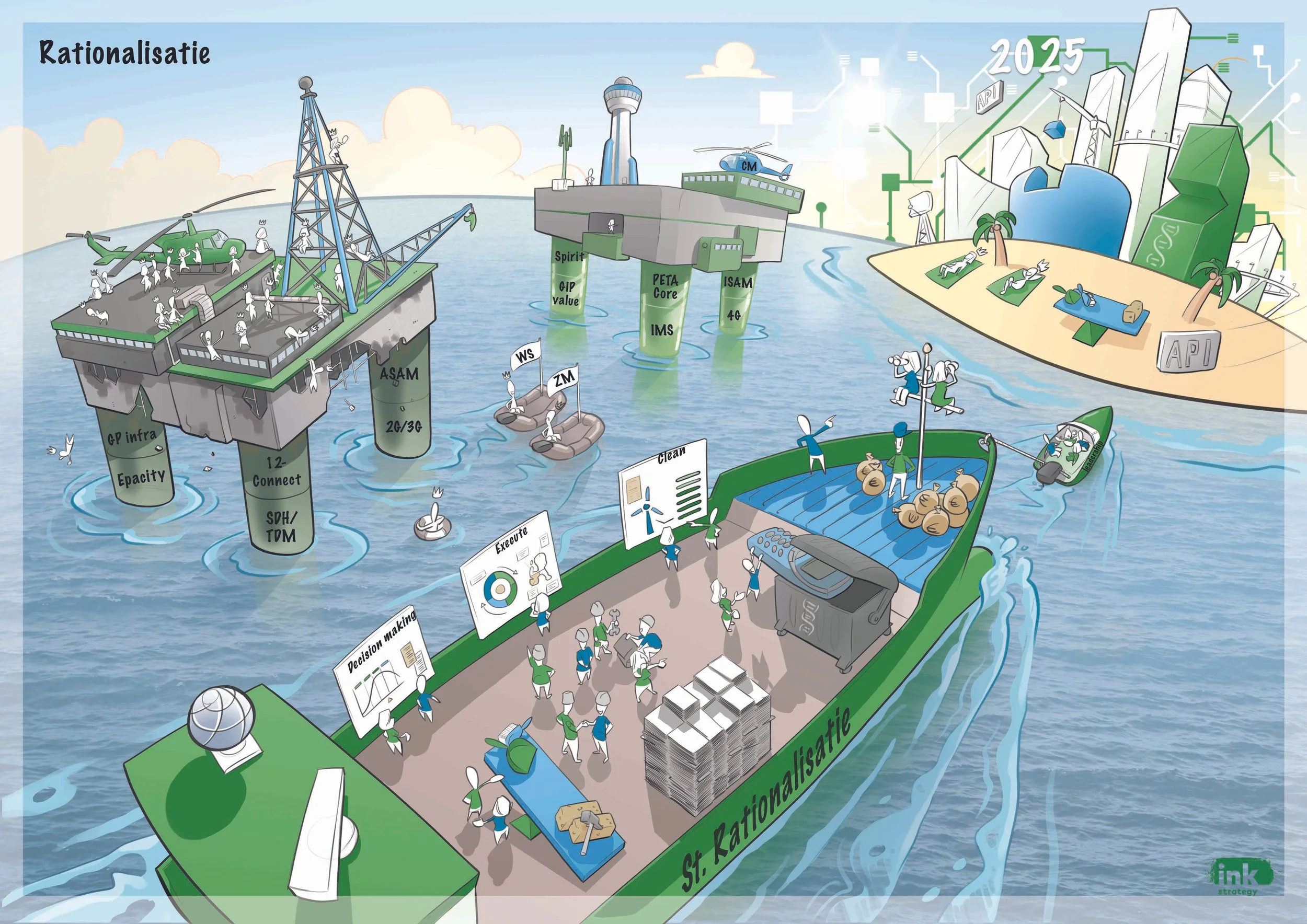
Example of what we made at Ink Strategy. The goal isn’t to understand every detail, but to immediately see the system.
From communication tools to thinking modes
Text and visuals are tools for communication, but while we use them, they quietly shape how we think.
Text unfolds information sequentially. As we work with it, we're naturally pulled into linear thinking: step by step, cause and effect, progression toward a conclusion.
Visuals work differently. Because they show structure all at once, they invite holistic thinking: seeing relationships, context, and the bigger picture before worrying about order.
Neither is better. They're built for different jobs.
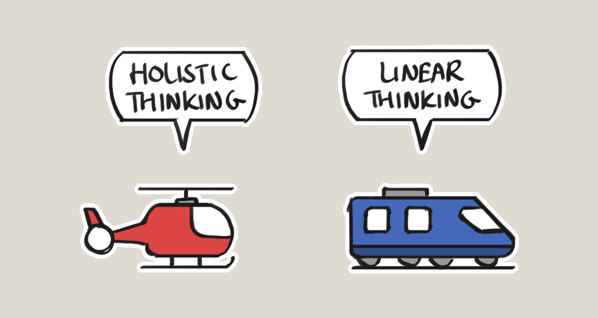
Linear thinking is excellent for step-by-step explanations, procedures, precision, and detail. Holistic thinking is essential for orientation, understanding systems, making sense of complexity, and creative problem solving.
Problems arise when we use linear tools for tasks that require overview, or when we rely on holistic sketches where precision is needed.
Why we experience death by PowerPoint
This is where most meetings go wrong.
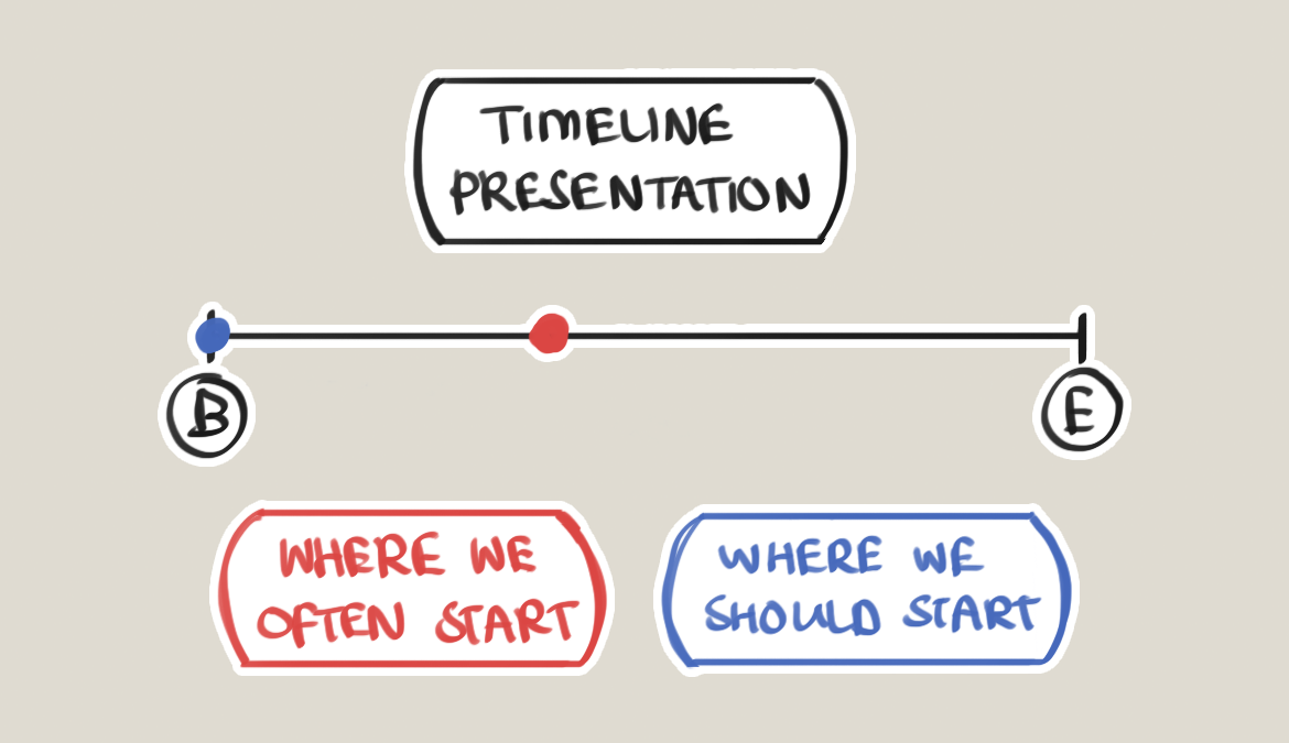
Because we're taught to communicate sequentially, we often jump straight into details, slide one, slide two, slide three, without first creating a shared understanding of the bigger picture. No context. No orientation. No common goal.
So people lose track of what the presentation is actually about. They stop following. They open their laptop and work on something else. Not because they don't care, but because the structure is missing.
Holistic thinking comes first
Whenever people come together to discuss something, the first job is simple: make sure everyone is looking at the same picture.
That means starting with holistic thinking, not linear thinking. First, align on the big idea. Then work out the details.
There are many ways to activate holistic thinking. You can use a framework. You can tell a story. But one of the simplest and most effective ways is to draw.
Drawing doesn't replace words
This is not an argument against text. Text is great for nuance, depth, precision, and documentation. But text works best after there is something to land on.
Visuals create the structure. Words fill in the details. Holistic first. Sequential second. Not either–or, but in the right order.
Why this matters for you
If you already draw or sketch, even casually, you're probably sensitive to this difference in a way most people aren't. You may have felt uncomfortable or "slow" during text-heavy presentations, frustrated explaining something that feels obvious to you, or calmer once you can finally see the whole picture.
That's not a personal flaw. It means you're wired to notice when the structure is missing, and that's actually a significant professional advantage.
And here's the good news: drawing to communicate doesn't mean drawing well. Stick figures are fine. Shapes and arrows are fine. The goal isn't to make art. It's to create clarity.
A small shift that changes a lot
For your next meeting, presentation, or brainstorm, don't start with slides or bullet points. Start with an image, a sketch, or a question that sets the context.
Once everyone sees the same picture, words suddenly become much more powerful.
If you want to go deeper into this way of working, that's exactly what my visual communication course is designed for, building the skill of communicating with visuals so it becomes a natural part of how you think and present professionally.
But even without that: start visually. It changes everything.